To help me create a name for my magazine, I created a mind map. This helped me come up with ideas that were appropriate to my magazine, music and genre.
I chose Plectrum because I felt it was appropriate to my genre of rock as rock is often known for it's use of heavy/electric guitars. I also felt that I had some interesting ideas as to how I should design the masthead and the rest of my magazine to fit with this name.

Masthead Font Ideas
To help with the end design of my masthead/magazine name, I have chosen a selection of fonts which I feel would fit my magazine and which I can later develop into something unique.

Alterations of Chosen Masthead

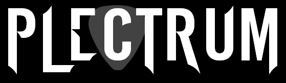
I have chosen to use a plectrum in all of my designs as it is appropriate to the name. In this design, to make the Masthead appear less divided, I have faded the plectrum into the background so that it doesn't distract from the name. This also helps the Masthead text to stand out as a whole and appear more bold.
 For this design, I only made a small alteration of shadow inside the 'C' in an attempt to combine the two designs above.
 I also experimented with putting the plectrum in a different place, however, I feel this was less visually pleasing and made the end of the Masthead appear cramped.
No comments:
Post a Comment