Thursday, 26 February 2015

The Finished Front Cover


This is my finished front cover for my rock magazine, Plectrum.
As an improvement, it was suggested that I take away some of my previews, however, I decided against this because the majority of conventional rock magazines are very crowded and busy in appearance as this gives them a more energetic look. It was also suggested that I enlarge the previews but I felt this would cause overcrowding and also distract from the main cover line and model.

Thursday, 5 February 2015

Magazine Cover Plans and Ideas

To help with my choice in magazine cover photo, I created some rough drafts and tests which helped me see which images would look most fitting and appropriate for my cover.

This could be a good choice of front cover as the model I have used in this photo is centred, leaving a reasonable amount of space for previews, special offers and extra photos around the edges. The position also leaves enough space for the models head to be over the Masthead without making the words unreadable. Along with this, due to the low positioning of the guitar, there is a convenient placing for the band name as there is nothing to obstruct the view or damage the readability of the writing. 


I feel that this could be a good choice in cover image as it shows the whole band. However, I feel that the image is not quite right as the band look a little caught off guard in the photo, for example, the model on the far right isn't looking at the camera. I also feel that it doesn't work well as a cover image because there is no space left around the edges for previews and special offers, therefore meaning that writing would have to be over-laid on top of the band which would give it an untidy finish.


In my opinion, this would make a good cover image as, unlike the image before, there is enough space around the edges for previews and special offers. Along with this, there is direct eye contact which makes the cover appear engaging. I feel that the general positioning also creates an interesting cover photo as it is different and more eye catching than a completely centred pose. However, I feel this image is too over exposed and lacking in colour to create an eye catching cover because all colours in the photo are muted.


This cover, in my opinion, would be the best choice as it holds many aspects which make it fitting to be a cover. Aspects such as the positioning are good because the way the model is positioned means that plenty of space is left for previews, special offers and other images. I also prefer this cover as the forest background gives the cover depth and creates an eye-catching appearance.

Sunday, 18 January 2015

Magazine Photos

This is a collection of the final images I have chosen to go inside my magazine. Although I will be unable to use all of them, these will be the final images I choose from as they were the most fitting of my large collection.

2 Foot Moose
2FM are a five piece rock band based in Gillingham, Dorset. Minus a bass player, they allowed me to take photos of them for my Media Studies magazine.
These are the 30+ best photos from my whole collection of approx 500. Due to the type of photoshoot and type of photos being taken, I felt it would have been easier to take as many photos as possible so not to risk only having photos that went wrong or had blurs of movement. In my opinion this worked as the majority of my photos did end up not working out and so this helped me to narrow it down to the best few.

I feel this could be an effective choice of front cover photo or page photo in my double page spread as it is set at an interesting angle, therefore making the cover appear more interesting and 'quirky'. Along with this, the reader will feel engaged due to the direct eye contact in the photo.
However, in order to make this photo look more professional, I will have to crop it slightly and replace the background for a plain black one. Cropping will get rid of the extra space on each side and will also ensure that the heads of each member come over the Masthead.


In my opinion, this is a good photo due to the lighting coming from behind that causes illumination. However, this photo would not make a good cover photo due to the lack of eye contact and positioning/angle of the photo which is not centered. Be that as it may, this photo could make a good extra for my contents page or 'posters' section on the cover.


Both of these images could make good front cover photos as each holds direct eye contact and is centered, allowing space for previews and special offers along with extra photos and the Masthead. To help them to stand out and to create a less distracting background, I would replace the background with one of plain black.


Anna Bundy
For my second photoshoot I took photos of Anna in my chosen location of Bluebell Woods. I chose Bluebell woods because I felt the location seemed menacing with it's looming trees and darkness. For this photoshoot, I took more precise photos as I had planned exactly what poses were needed and so I took a smaller number of photos, ending up with 24 good images out of 56.

I feel this is a good photo because the focus is on the model and there is direct eye contact to engage the audience. Along with this, the image is made appropriate to the magazine name of Plectrum due to the use of guitar in the photo. However, this photo would be unsuitable as a cover photo due to the obstruction of the face and position of the camera. As this is an extreme close up shot, there is no space for the Masthead or previews unless they are layered on top of the face which would be a bad choice as a lot of magazines place text around the model rather than on top.


 Both of the photos could make suitable cover photos as they each make eye contact and also leave enough space for the Masthead and previews around the edges. Along with this, the image on the left was taken from a low angle which creates a sense of power and popularity in the model as an artist.


Saturday, 17 January 2015

Magazine Name

To help me create a name for my magazine, I created a mind map. This helped me come up with ideas that were appropriate to my magazine, music and genre.
I chose Plectrum because I felt it was appropriate to my genre of rock as rock is often known for it's use of heavy/electric guitars. I also felt that I had some interesting ideas as to how I should design the masthead and the rest of my magazine to fit with this name.

Masthead Font Ideas

To help with the end design of my masthead/magazine name, I have chosen a selection of fonts which I feel would fit my magazine and which I can later develop into something unique.


Alterations of Chosen Masthead


As it likely my magazine cover will have a black background, I have designed my logo on black. In this particular design, I have fitted the 'C' into a metallic in appearance plectrum which gives the Masthead a rock/metal look. However, I feel that the change in colour perhaps fades the 'C' out too much and almost splits the Masthead in two.


I have chosen to use a plectrum in all of my designs as it is appropriate to the name. In this design, to make the Masthead appear less divided, I have faded the plectrum into the background so that it doesn't distract from the name. This also helps the Masthead text to stand out as a whole and appear more bold.

For this design, I only made a small alteration of shadow inside the 'C' in an attempt to combine the two designs above.


To help the plectrum stand out a little more without seeming overbearing, I added a thin white line. However, much like the shadow inside the 'C', it made little difference and is almost unnoticeable.


I also experimented with putting the plectrum in a different place, however, I feel this was less visually pleasing and made the end of the Masthead appear cramped.


Tuesday, 6 January 2015

Location of Photography

These are my possibly locations for the photography of my magazine.

Photography Studio

I feel it would be good to get photos of my models with a blank background behind them as a lot of magazine covers have plain backgrounds to bring all focus to the band. A plain background is also easier to cut out using programs such as Photoshop. Along with this, such a place would be appropriate for experimenting with different light sources such as single and three point light sources.


Marnhull (or Mere) Graveyard

This graveyard would be an appropriate background for my photography as I could create a theatrical Ghostly/Zombie scene in it and Goth's are stereotypically said to 'hang out' in Graveyards. I feel there are several parts which would make particularly good backgrounds such as the large iron gates or the huge church doors as both have a Gothic look and would be much like the architectural feature in the Bad Pollyanna image I analysed earlier. Along with this, having gravestones in the background would create an appropriate background for a Ghost/Zombie scene as they are symbolic of death and would make the band seem creepy and deathly. If I were to go inside the church, I could take some Gothic looking images much like the ones I analysed earlier of the dramatic close up shots and the interestingly posed model with a slightly theatrical style. Another feature could be the small cluster of trees in the graveyard as these create a menacing and dark appearance with many dark shadows, therefore making the band seem somewhat evil which will separate my imagery from the far friendlier look of other magazines such as pop.

Old Sherborne Castle

In my opinion, this would be a fitting scene as there are lots of dark and abandoned in appearance parts to the castle, for example the photo on the right. Along with this, I could take some interesting photos with the ruins of the castle in the background and perhaps have the band emerging from the fog, this would cause the castle to appear faded subtley into the background, much like the architecture faded into the background of Bad Pollyanna's image.

Shear Water

I could create many atmospheric shots either in or around this lake. For example, I could have one of my models emerging from the water as this would relate to most horror movies and create a frightening atmosphere, therefore creating a Gothic effect of fear. Along with this, I could have the silhouettes of my models stood in front of the lake on a stormy day, therefore making the lake appear grey and lifeless and the overall image to appear somewhat angry and intense.


Crockerton Forest

To make my magazine obviously rock, I am sticking to a Gothic stereotype which is often associated with horror movies. A forest is often set as a scene for horror movies, therefore making it fitting for my photos. I could get many photos of my model(s) emerging from the trees and create ghostly horror movie style images. However, I also feel that Blue Bell Woods in/near Mere would be a good choice due to the many fallen trees and great height of the upright trees, along with this, there is an abandoned tent that looks as though it were attacked by an animal. I feel this abandoned tent would create some great images as they would appear frightening and as though they had come straight out of a horror movie.

Friday, 12 December 2014

Magazine Photography Planning

To help me when I come to taking my photos, I decided it would be a good idea to plan exactly what kind of photos I need so that I can get the best out come possible rather than throwing together a few poses in the moment of photography.

I feel I would like to take a few simplistic group shots of my chosen models/band members with serious facial expressions as I've noticed that this is common kind of photograph taken of bands, for example, the image of Black Veil Brides on the left.
- Use plain/simple background
- Main focus should be the band
- Lead member of the band up front? Made to stand out more?
- No props to add to the simplicity


Another kind of photo I would like to try taking is a theatrical style of photo such as the one on the left.
- Simple background or maybe a background that fits the theatrical scene (Zombies or vampires in a graveyard?)
- Dramatic, theatrical make up
- A simple yet fitting costume? Must be achievable so not too dramatic
- Props to fit the scene


I would also like to take a dramatic close up shot much like the one to the left.
- Perhaps using Anna due to her pale skin and long hair?
- Dramatic make up (Deathly effect, pale face, bruised eyes?)
- Close up
- Three point lighting?
- Blurred out background to bring main focus to model.
- Maybe serious facial expression
- Or perhaps a slightly more dramatic facial expression like the one on the left.


Photo of interestingly posed model in a slightly theatrical style.
- Similar to theatrical style of photo but more elegant with perhaps a single person.
- Would need a fitting choice of clothes, for example, in the image on the left, the model is almost bird like and her dress looks almost feathered (looks like the coat of a raven)
- Could use a plain background to bring more attention to the model and her/his interesting style of pose.
- Blurred sections/body/edges to imply movement?


A Medium shot could be used to show the prop being held and to give a limited view of the background.
- As a lot of background space would be on show, it might me best to use a specific scene.
- Strong body language and facial expression or perhaps use delicately shocked/nervous body language and expressions to create an interesting effect similar to the image on the left.
- Fitting props (Roses, Microphone, other object?)


Perhaps try recreating a concert scene? Could show variation in imagery and would look different to most of the other kinds of photos.
- Props such as Guitars, Microphones and amps would be necessary to create a realistic scene
- Correct lighting would be necessary (Different light points such as the ones at most concerts)
- Appropriate concert clothing (Is band theatrical in style or simplistic?)


I want to experiment with dramatic lighting to create different effects such as the darkness on one side of the face in the image to the left.
- Try creating different shadows using different light sources.
- Three point light source
- Lighting only from above to cast dramatic shadows down face
- Singular light points?


Thursday, 11 December 2014

Photography and Logo Analysis


Bad Pollyanna
Overall, Bad Pollyanna have a unique look with their most recognisable feature being the intense stares achieved by make up and contact lenses.

In the photo, the lead singer stands out as a main part of the band by using bright colours, such as, her vibrant pink hair and purple clothing. She stands out as the other members are dressed in black, making the vibrant pink and purple become eye catching. Along with this, so not to distract from the band members, the background is simple, however, it is given a Gothic appearance by using what appears to be a faded out image of some kind of stone architecture overlaid on to a simplistic grey backing.

The Bad Pollyanna logo is intricately designed with the use of roses and thorns. The roses could symbolise that although beautiful, there is a danger beneath. However, the way the thorns are twisted, it reminds me of Sleeping Beauty when she was trapped behind the thorns, this gives the band a theme of fairytales.
Along with this, the text of the logo is done using a serif font which has been distorted slightly to fit the bed of thorns.
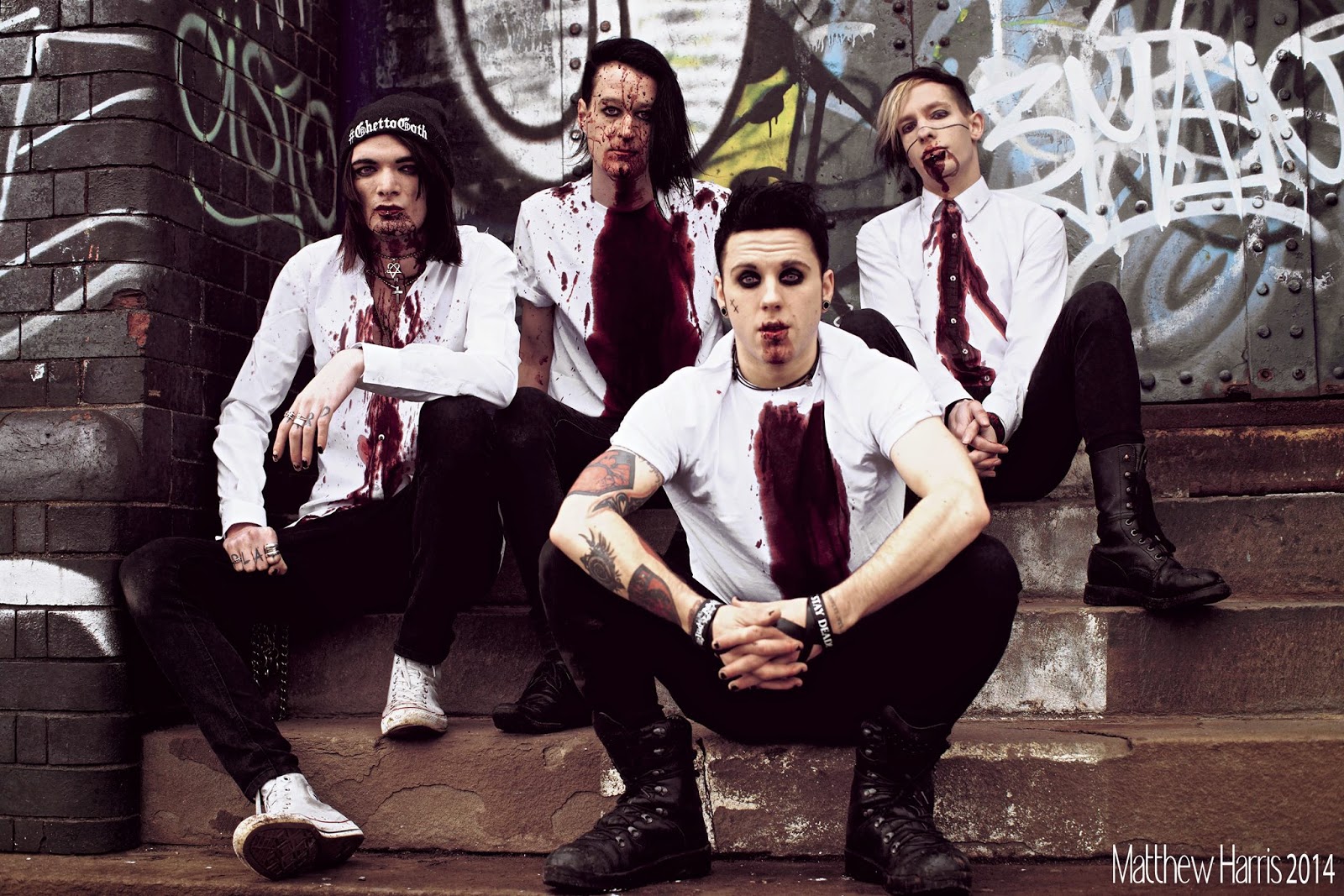

Ashestoangels
The main things that stands out in this image is the stark contrast of what appears to be blood on white. This is almost zombie like or vampiric as it implies the eating or drinking of something living and so it creates an uncomfortable feeling to look at.

To show who is the main person/lead singer, they have placed the lead at the front so he is closer to you in the photo. However, the use of steps to sit on makes it easier to see each member so that no band member goes unseen as each member is important.

As of clothing, each member is dressed in the same white t-shirt and black jeans, making them noticeably part of the same band.

The Ashestoangels logo is simplistic and written in a serif font, however, a unique look is given to the logo by it's use of erosion on each letter.
The logo is easily recognisable in it's simplicity and due to how common serif fonts are, the logo will become recognisable each time a serif font is used.


Her Dark Embrace
The band, overall, have a very simple appearance and don't seem to use any particular props or items of clothing, therefore not making anything in the photo stand out.

The photo, although uninteresting in appearance, takes on a Gothic look due to the use of black which is a stereotypical Goth colour. Along with this, the Gothic stereotype is added to by their dark facial expressions, this is effective as a stereotypical Goth isn't often painted as excitable or grinning.


The Her Dark Embrace logo is similar to that of Ashestoangels in it's use of eroded text and simple black and white colours. However, unlike the previous bands, Her Dark Embrace have a simple logo to go with their main one which can make the band more easily recognisable each time that simple logo/image is in view. To make sure the simple logo is associated with the main one, it has been faded out and put in behind the text, this gives the main logo an, overall, more interesting look.


Fearless Vampire Killers
It is immediately made obvious by the unique appearance that this band have gone for a more theatrical look, using heavy make up and interesting poses. The aim of this photo was to appear zombie like which has been achieved by using fake blood, overdramatic deathly make up and 'hungry' zombie like expressions.

This photo has been positioned in almost the same way that the image of Her Dark Embrace has been however, it automatically becomes more interesting simply by using different poses and contrasting colours.

Along with this, the simple black background means that no attention is drawn away from the band members and it also means that all other colours, such as reds and whites, stands out more due to the high contrast in colours.

Unlike the other logos, Fearless Vampire Killers have a more vibrantly coloured logo, using red to create an eye catching effect. This means that if posters were to be put up with their name, people would be more drawn to look at the posters as their eyes have been caught by the vibrant red which could lead to more band recognition.
To give the font a more interesting look, the bottom of the logo has been cut around what appears to be a city scape. This links with their band as their band and music are based on the novel Ruple and Evelyn and therefore, the city scape could be Grandomina, the place where the novel is based.

Fearless Vampire Killers also have a simple logo which is easily recognisable. I feel it is a good idea to have a small logo as it is easier to put everywhere and creates recognition of the band more easily without having to see the band name.
This small logo also fits with the band as it fits their name Fearless Vampire Killers. This is because the logo almost appears to be two fang like puncture wounds and then below, what looks like a pair of vampire fangs.


Black Veil Brides
Overall, this image is Gothic in appearance due to the dark greyscale tones. This creates a Gothic effect as you are unlikely to see vibrant colours in a Gothic stereotype. The image also takes on a style of rock as each member is wearing a leather jacket which is stereotypical in rock style. As each member is wearing a leather jacket, they have also been made to appear more obviously as part of the same band.
Although there is no obvious colouring to show who is the main member, the lighting illuminates the man in the middle, making him stand out in a subtle way. The background also helps as it makes each of the band members stand out more. The use of contrast in pale skin and black background creates a somewhat vampiric effect and makes the band members stand out.

Along with this, each member has a very intense facial expression, as though they are giving you a hard stare which almost intimidates you. This is effective as it makes the band seem powerful.

The logo for Black Veil Brides fits with the common colour scheme of black and white.
This logo is also simple as the text is a serif font with only a few subtle distortions such as that of the 'DE' in Brides. 
Much like the two previous bands, BVB also have their own simplistic logo which has been cleverly turned into a pentagram/star.